UC Berkeley - Instructor Dashboard Redesign | Case Study
OBJECTIVE
Design a prototype that helps UC Berkeley instructors create personalized bios and class pages, making it easier for students to discover courses and connect with professors during registration.
DESIGN PROCESS
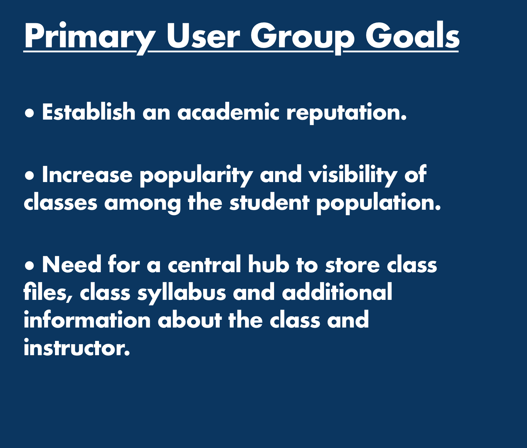
1) Establish Primary User Group
The primary user we designed our case study for is the Adjunct Professor.
Teaching new classes without an established student body, an adjunct professor is very busy preparing their syllabi, networking with fellow academics, and conducting research. They need an easy-to-learn, modifiable way to provide the student body with information about themselves and their classes, to make themselves more well known to the student body and encourage students to enroll in their classes.


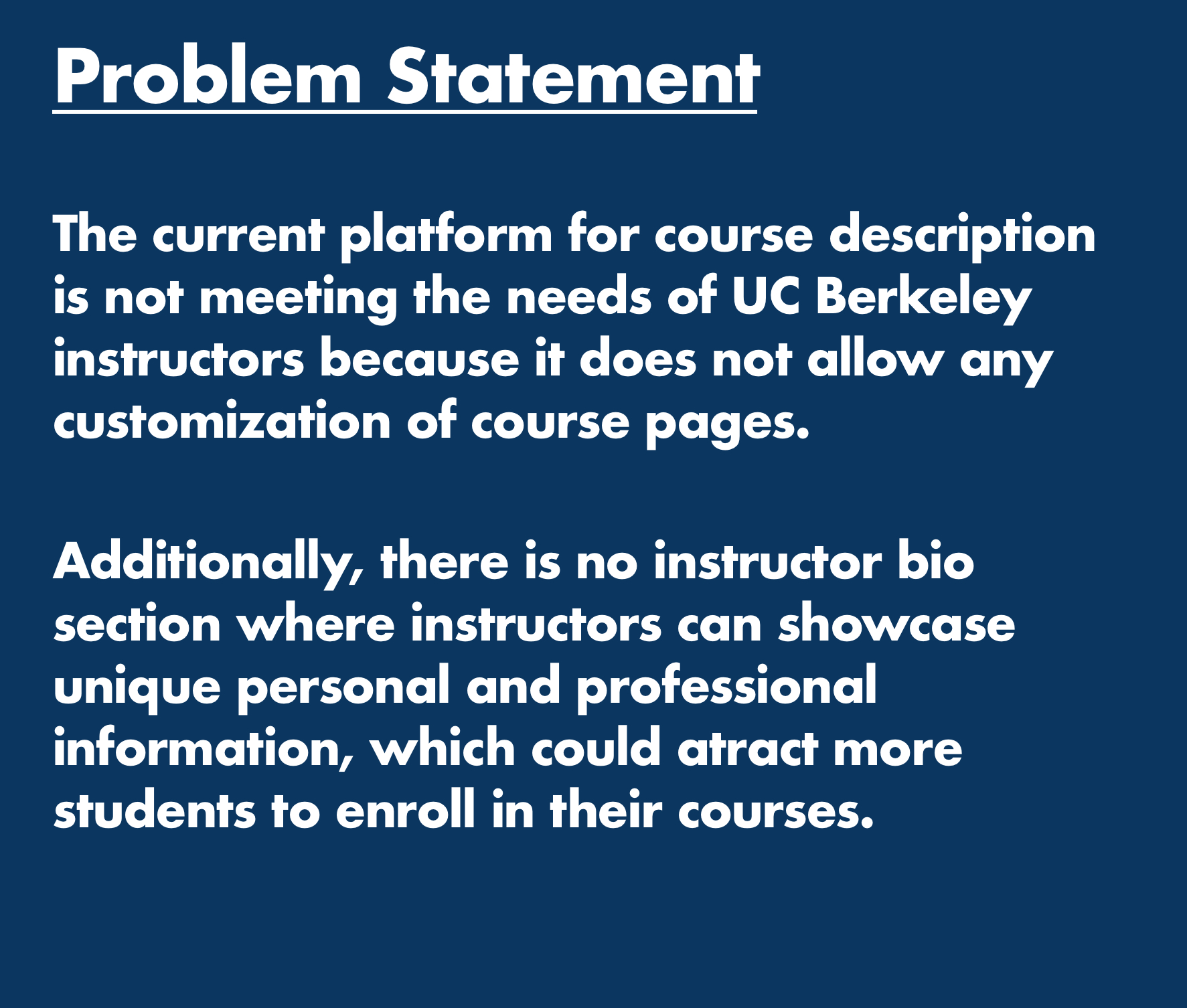
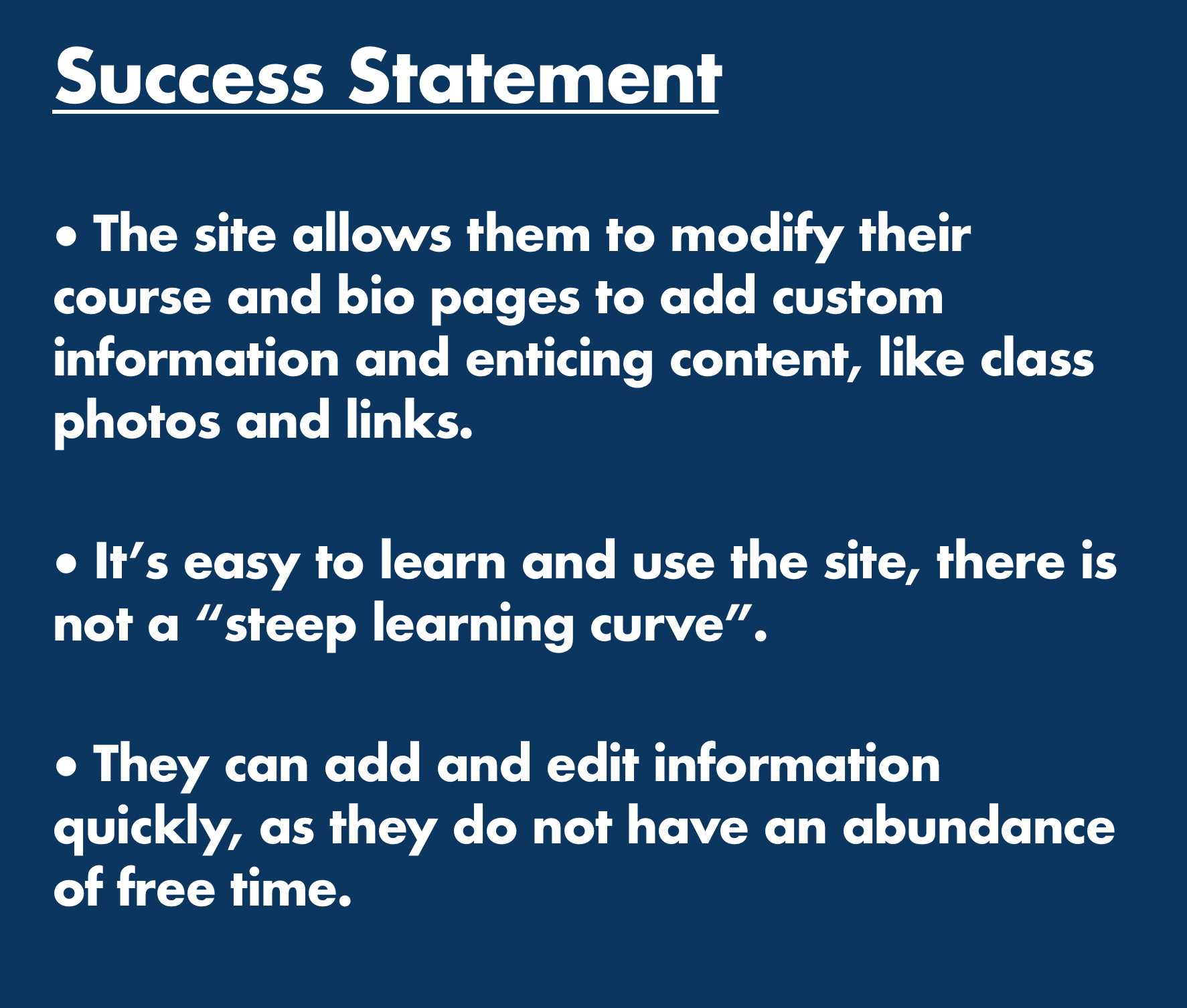
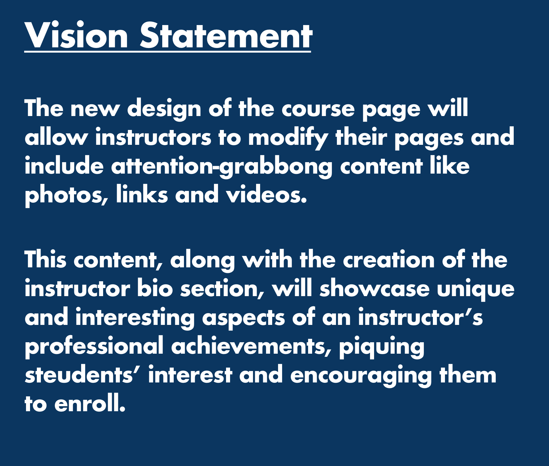
2) Determine Primary User Group Goals | Problem Statement | Success Statement | Vision Statement
Through the construction of User Goals and a problem Statement, Success Statement and Vision Statement, our team was able to better solidify our understanding of who Fred Barnes is, and what his goals are when using a new site design.
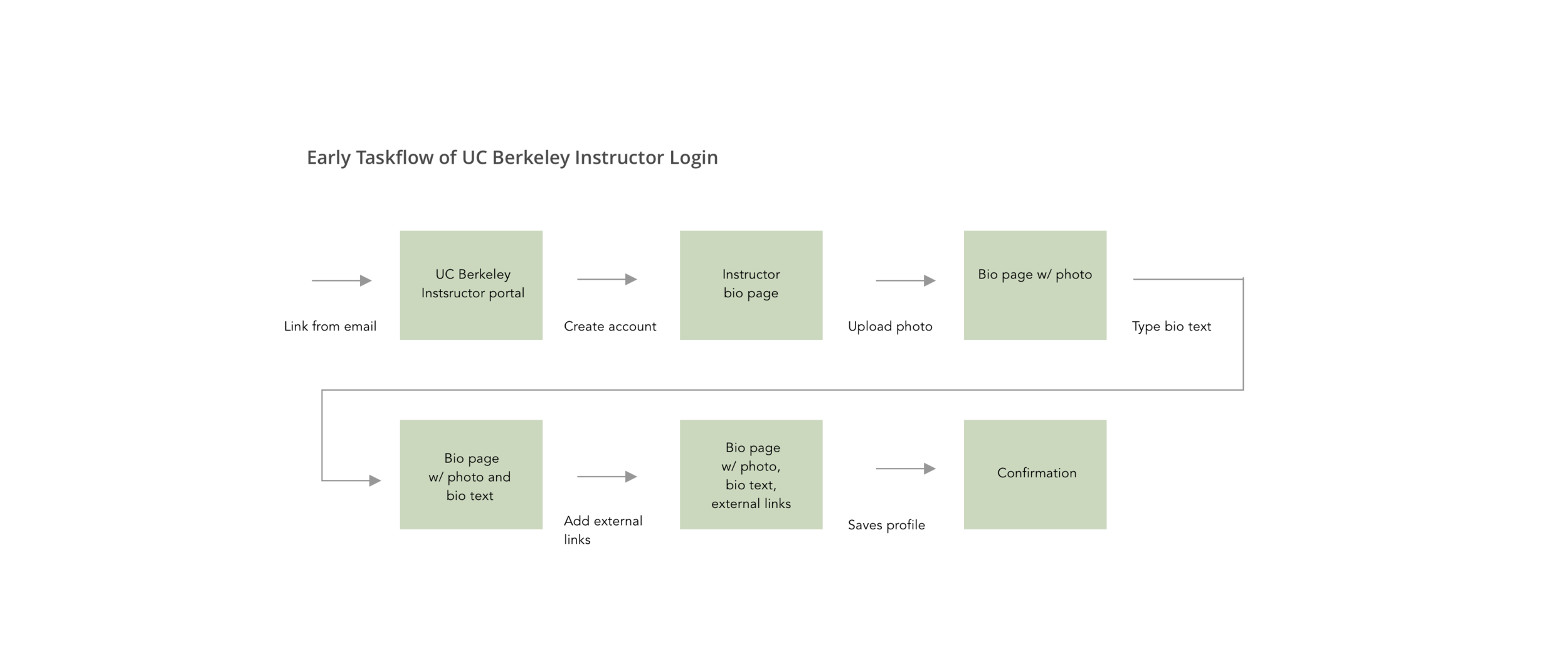
3) Create a Context Scenario and early Task Flow
Through the creation of a Context Scenario, we were able to walk through the various needs of our user. Using this is a basis for our task flow, we reviewed all the needs he might have for creating a bio and class page.
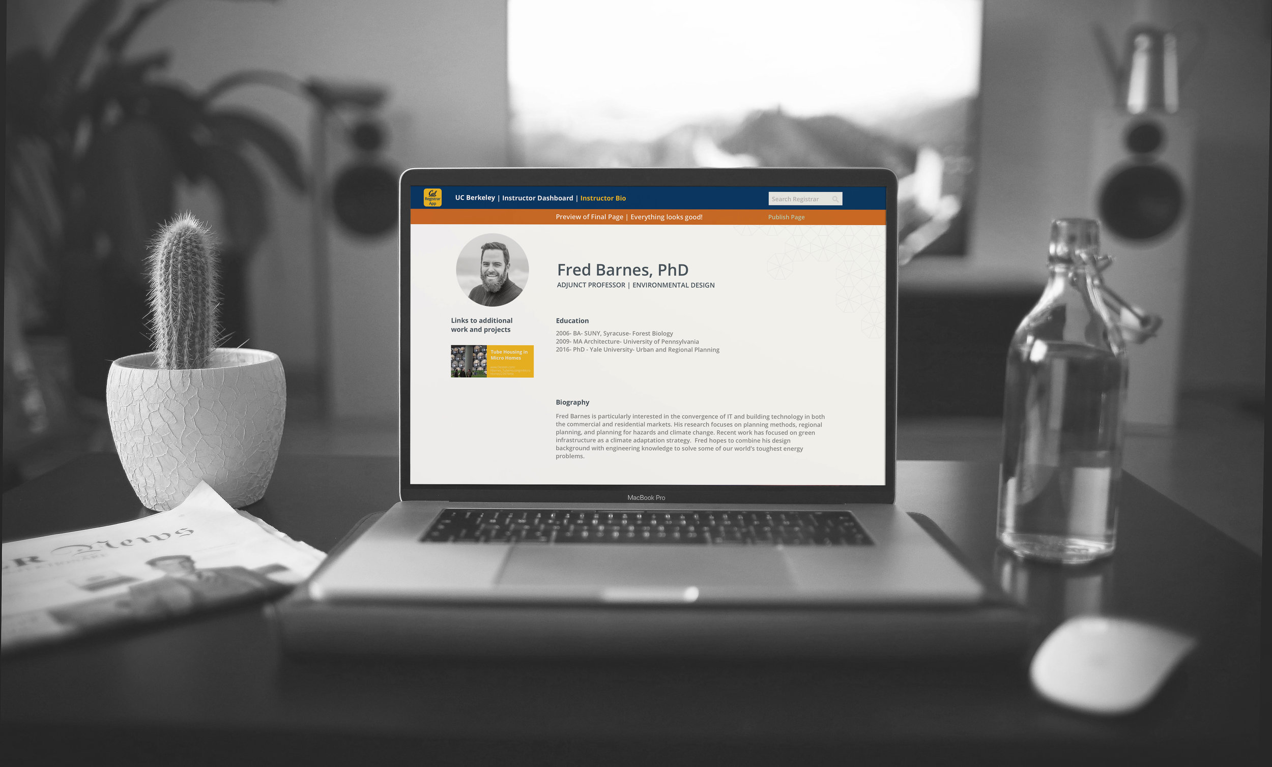
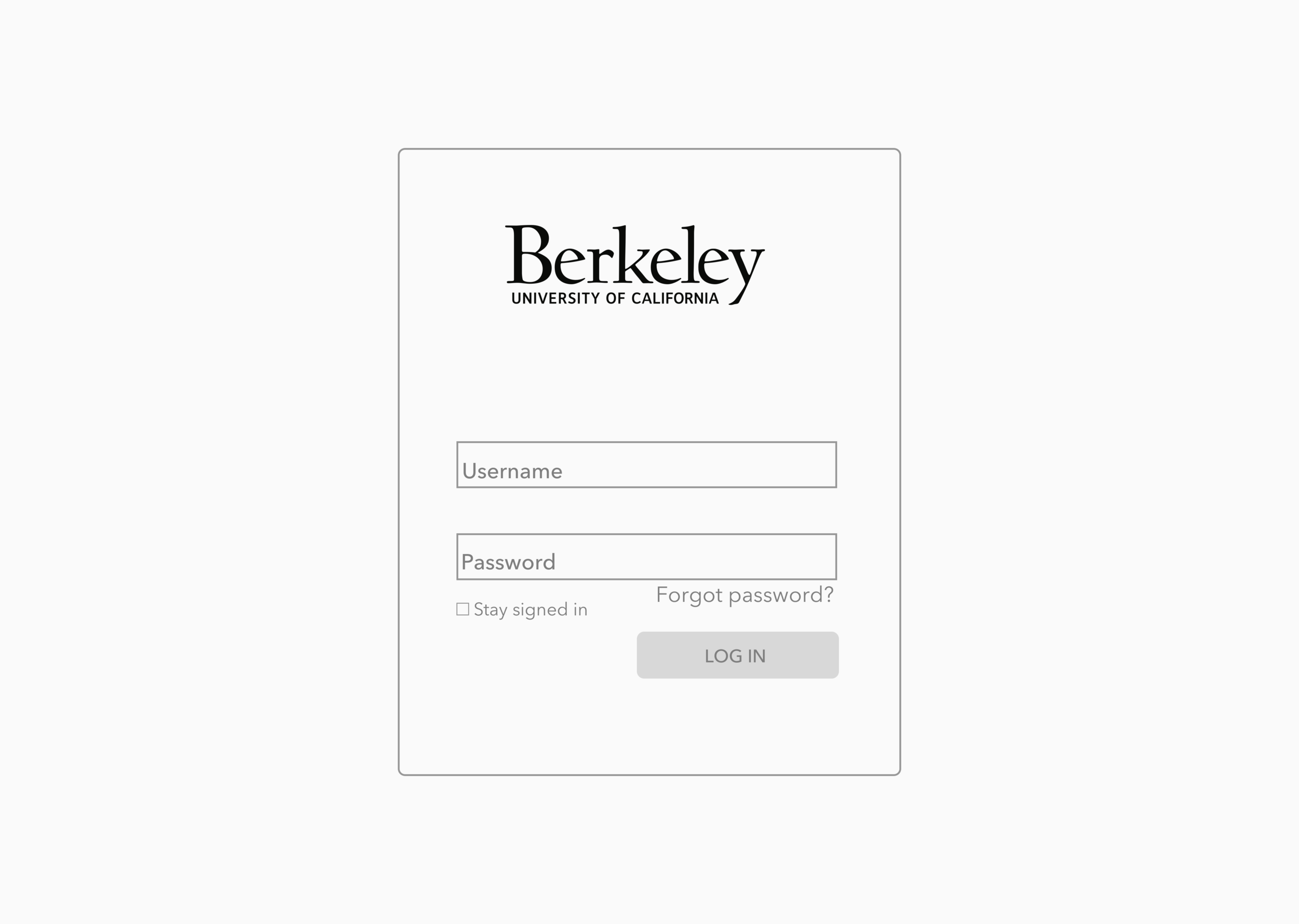
"Fred is a new adjunct professor in the Environmental Design department at UC Berkeley. He is looking forward to teaching two courses next semester at UC Berkeley. Fred receives an email from UC Berkeley with a direct link to the Registrar app.
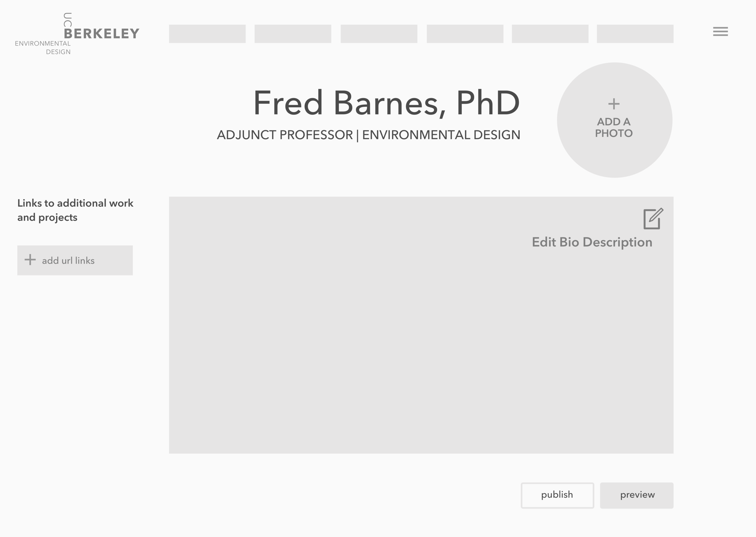
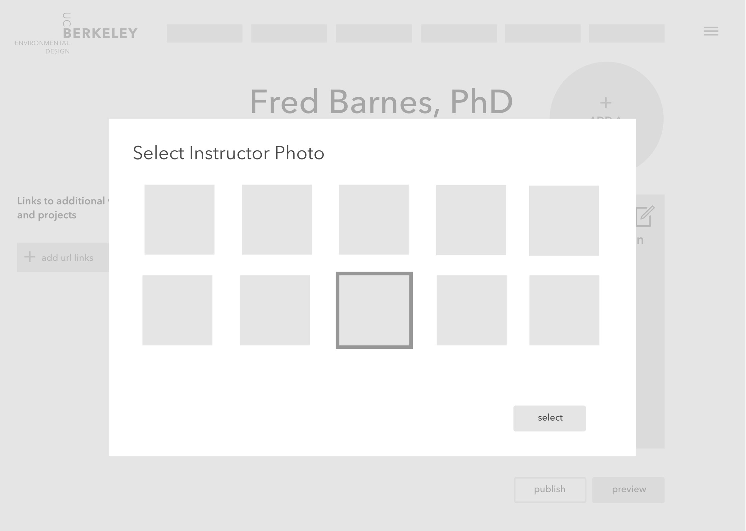
Fred clicks on the email link and is taken to the login screen for the Registrar site. He logs in and starts to update his bio page. He adds his educational background and a short bio, then uploads a photo of himself.
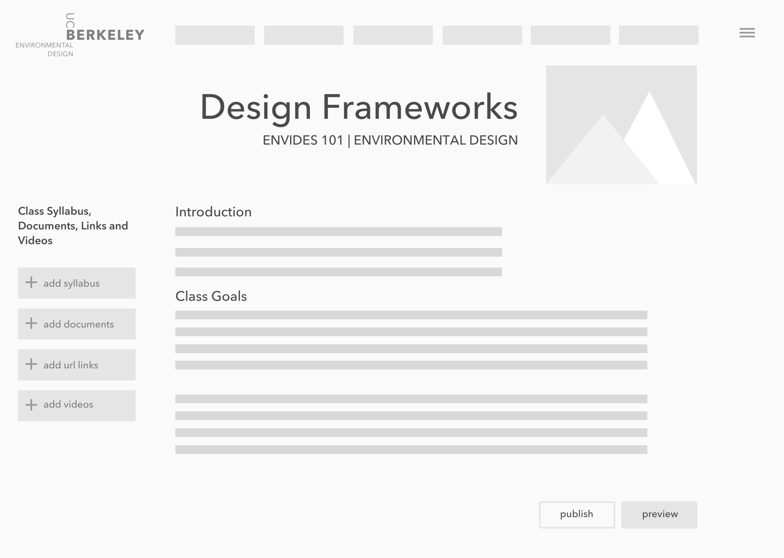
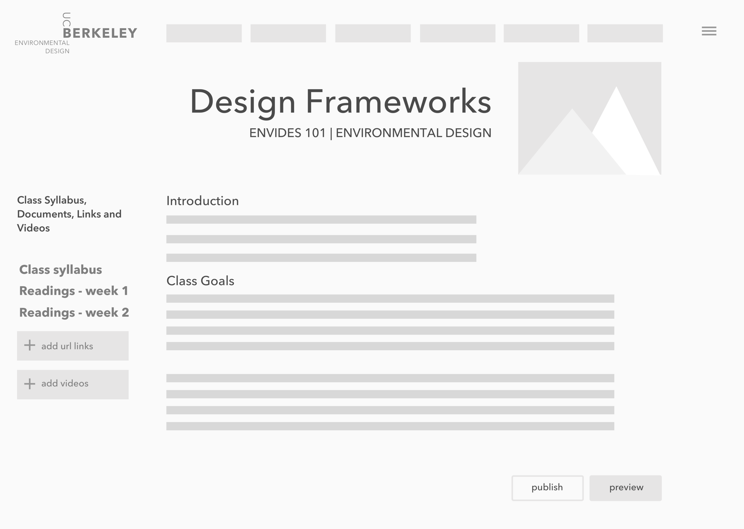
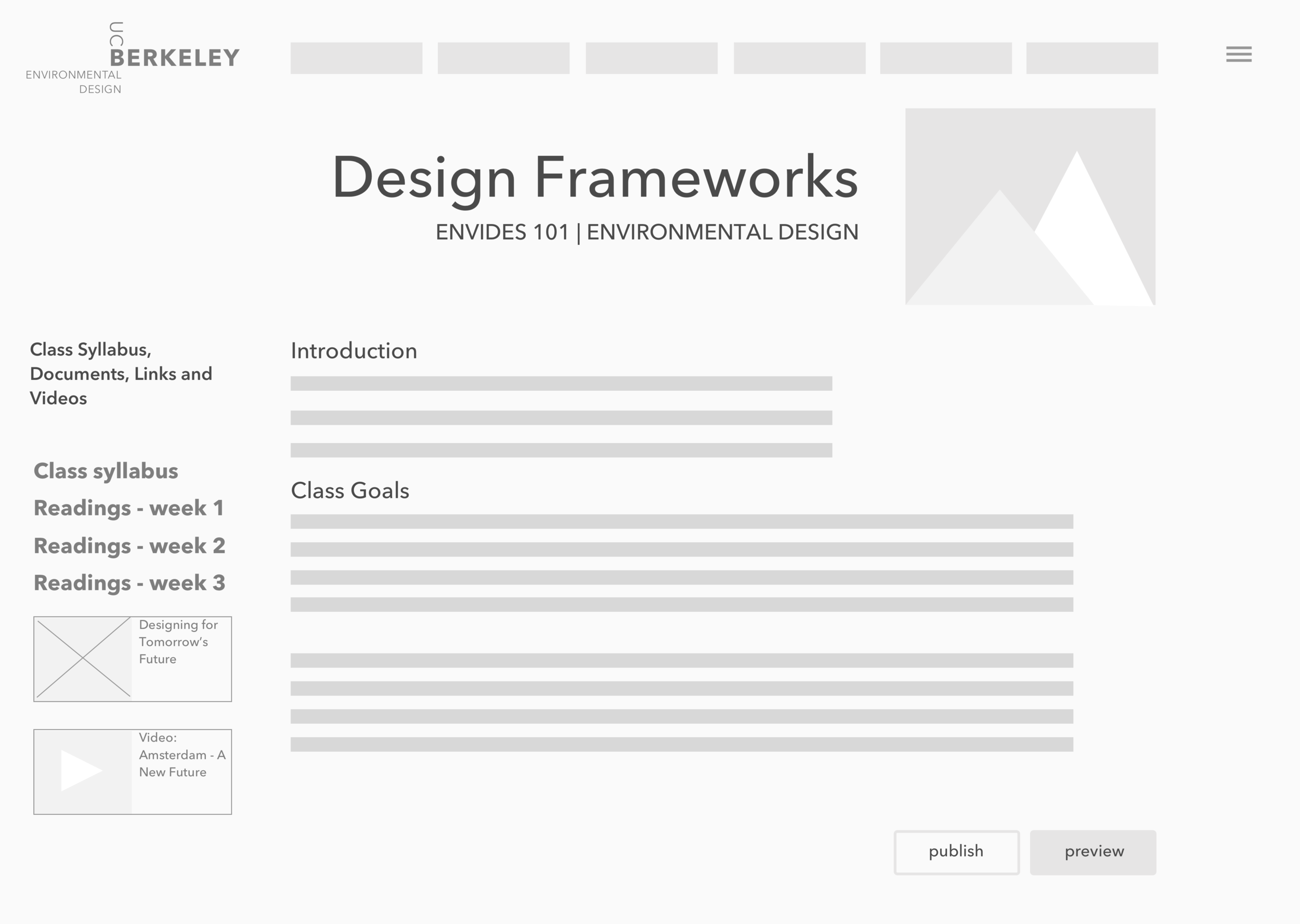
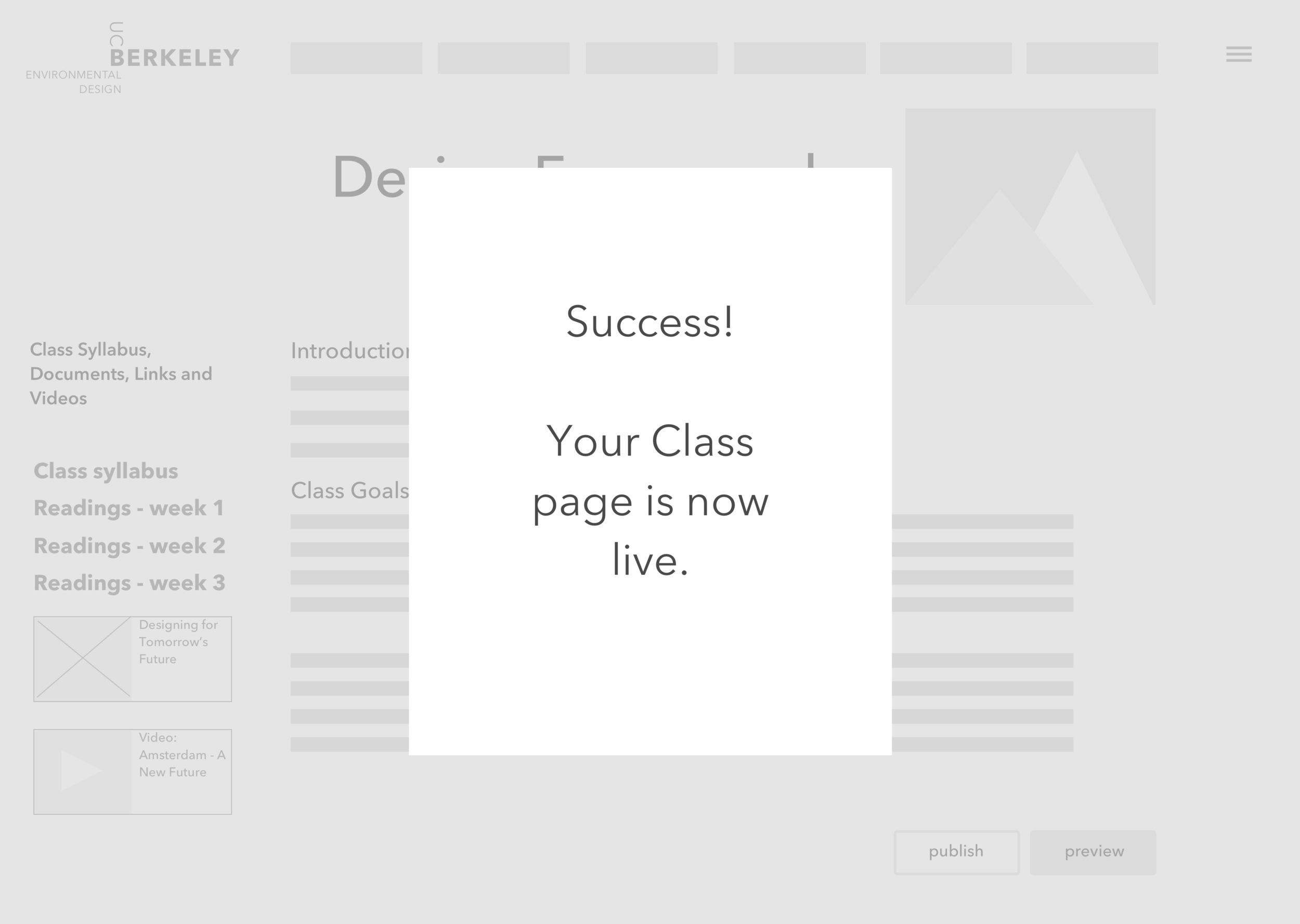
Once finished with the bio page, he uses the preview function to make sure everything looks good, then clicks on “Publish” to go live. Fred then clicks back to his Instructor Dashboard and sees pages for his two upcoming classes. He chooses to edit for the first one: “Design Frameworks”.
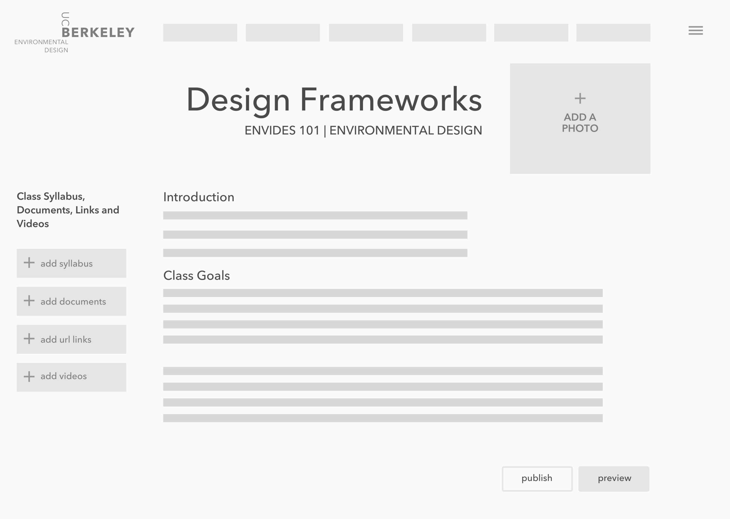
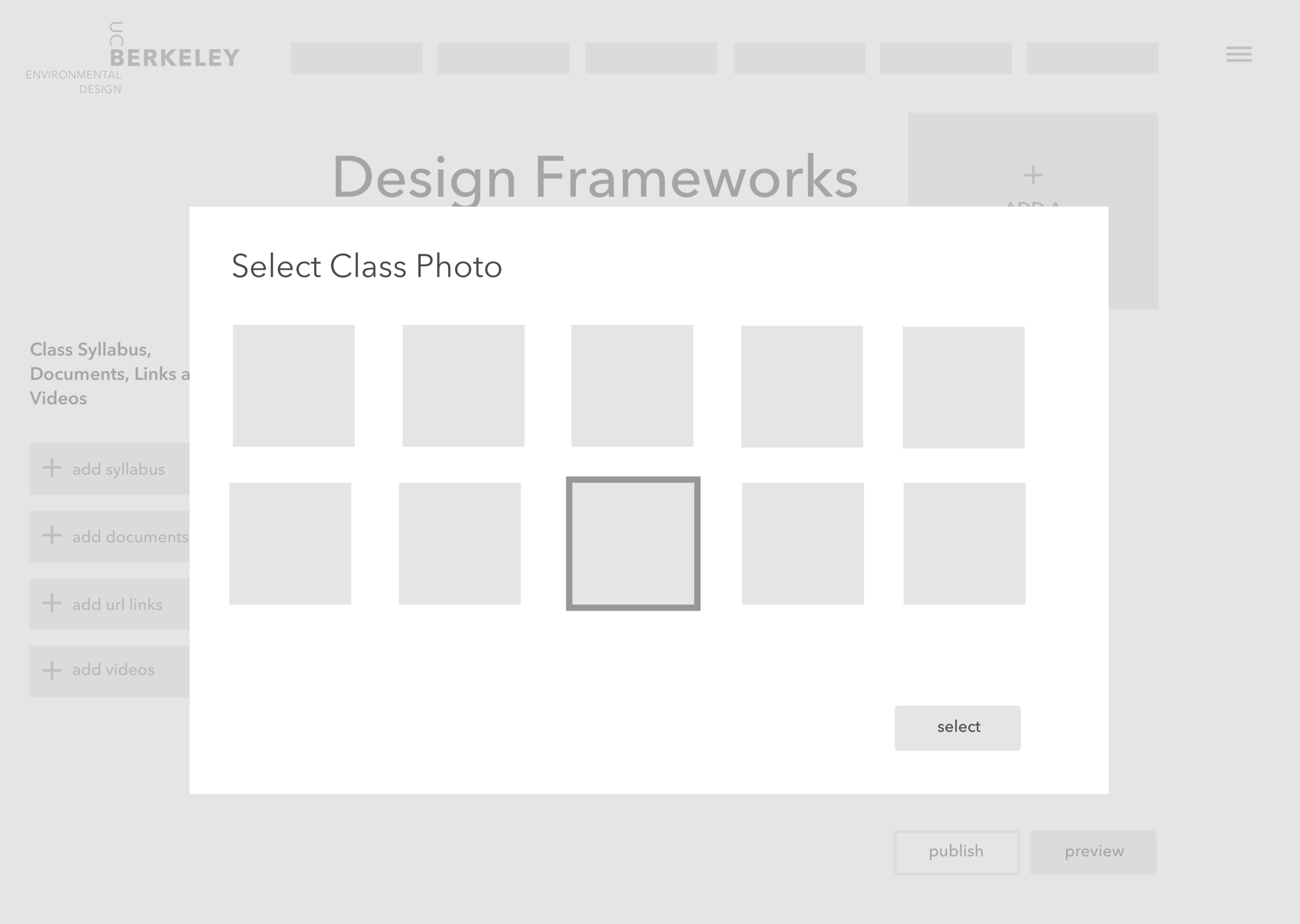
After filling in the course goals and introduction fields, Fred uploads a class photo from his laptop. He selects the option to add the photo to the Berkeley Image Library, so that other Berkeley instructors can use it.
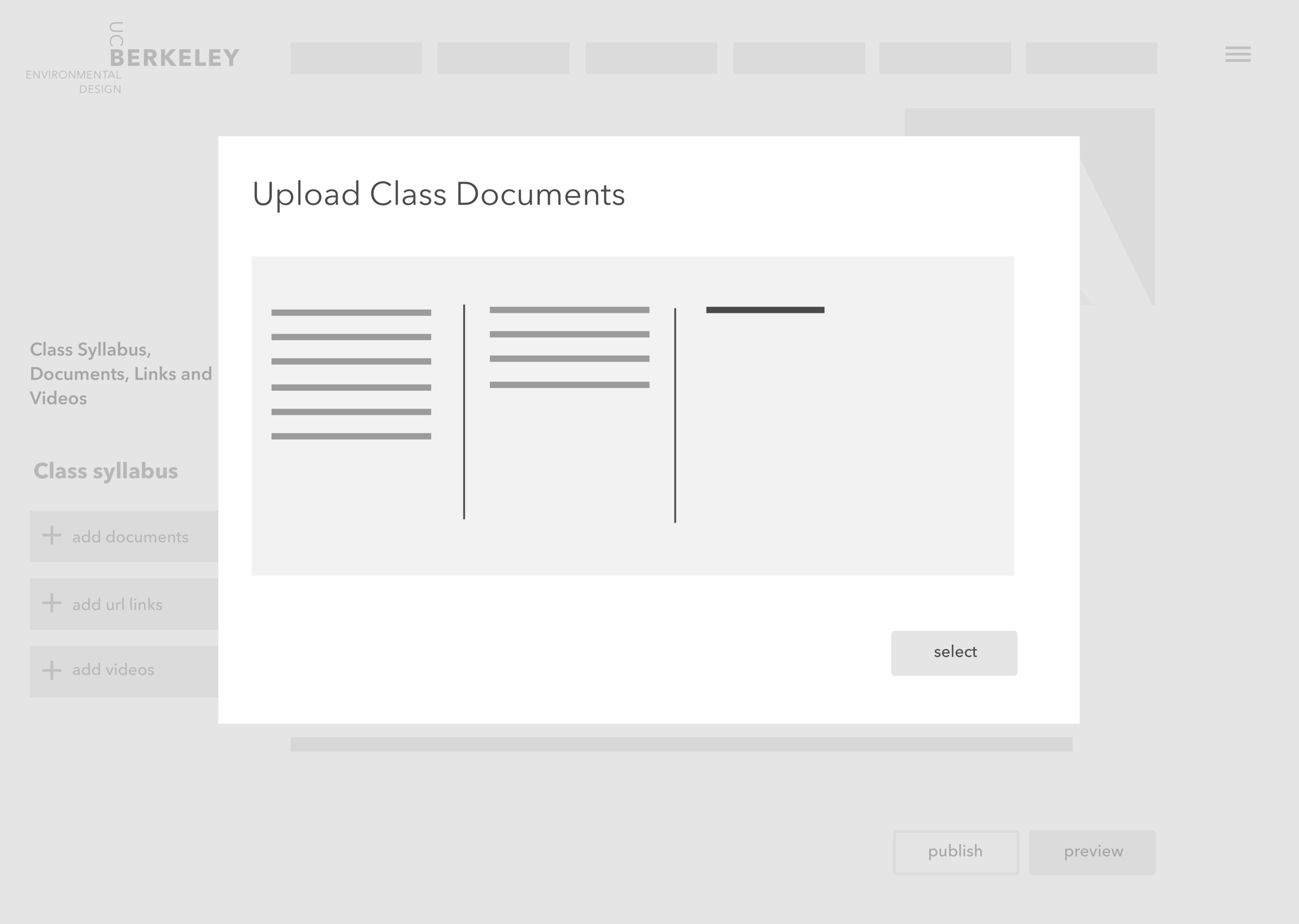
Fred then clicks on the syllabus upload feature and drags the syllabus file from his desktop into the upload modal and clicks “Upload.” He again previews the changes on this page before hitting “Publish.”
Fred receives an email notification that includes a link to the pages now live. “That was easy”, Fred thinks to himself. He can’t wait to meet his students next semester."
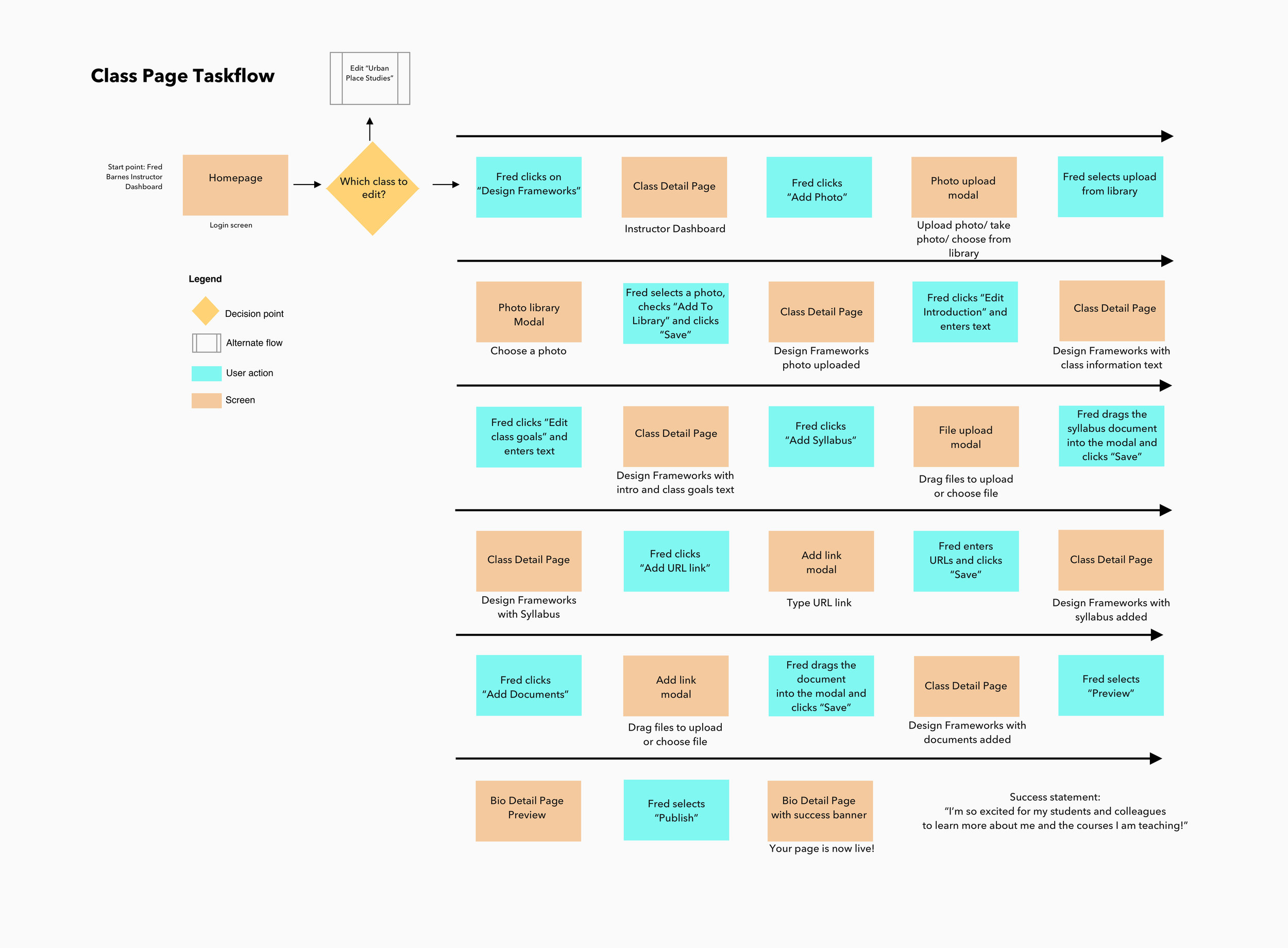
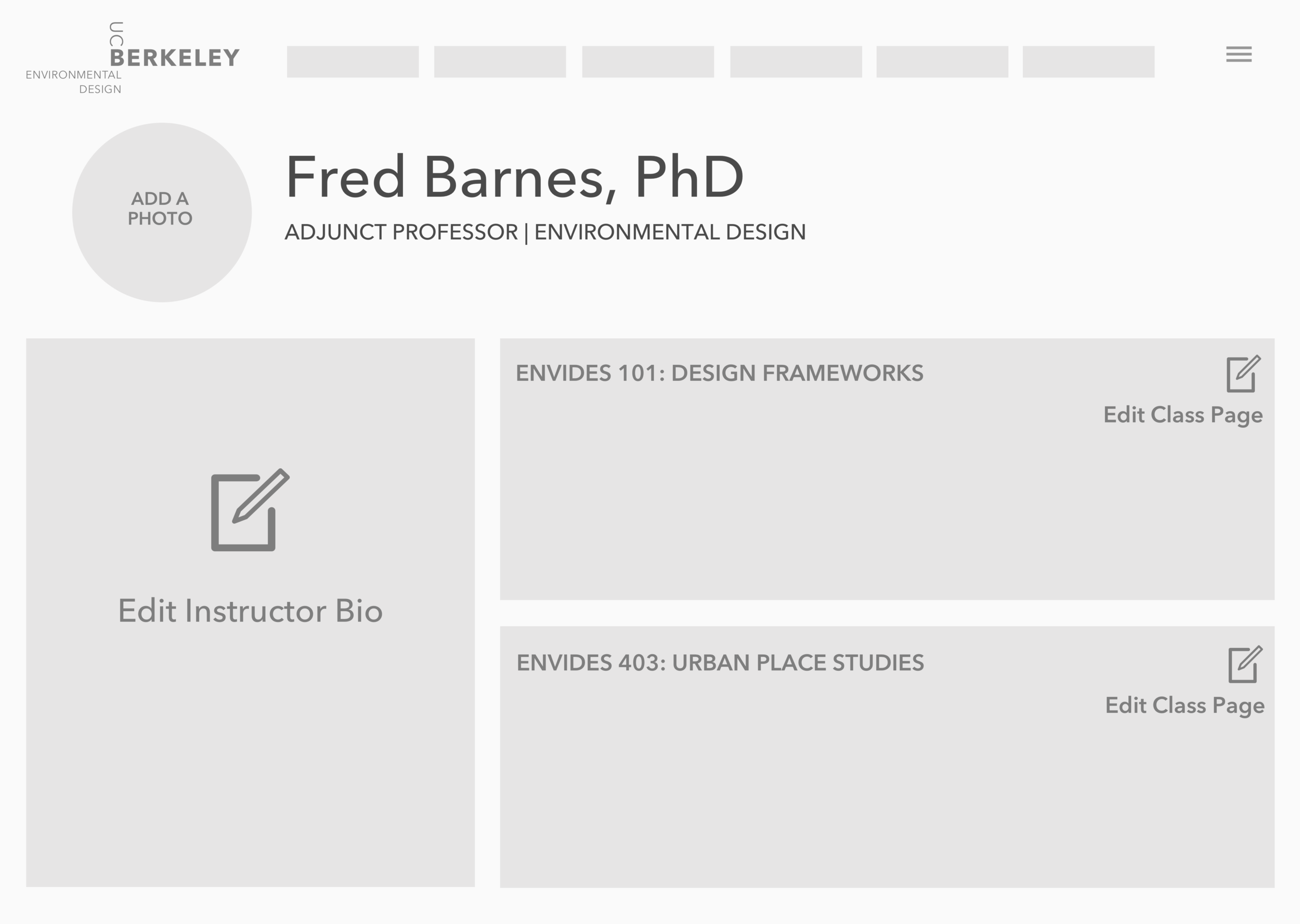
4) Revised Task Flow : Instructor Bio and Class Page
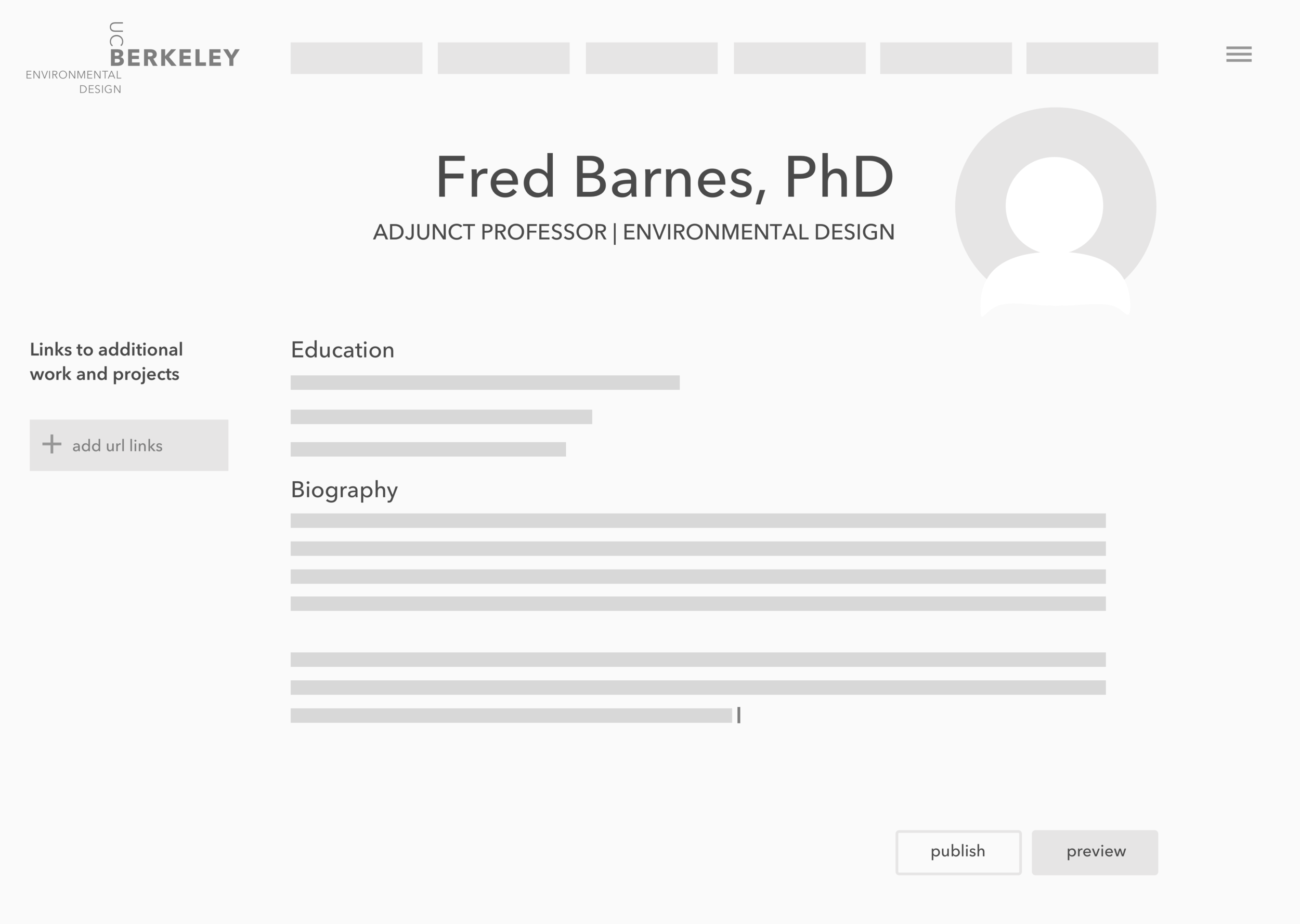
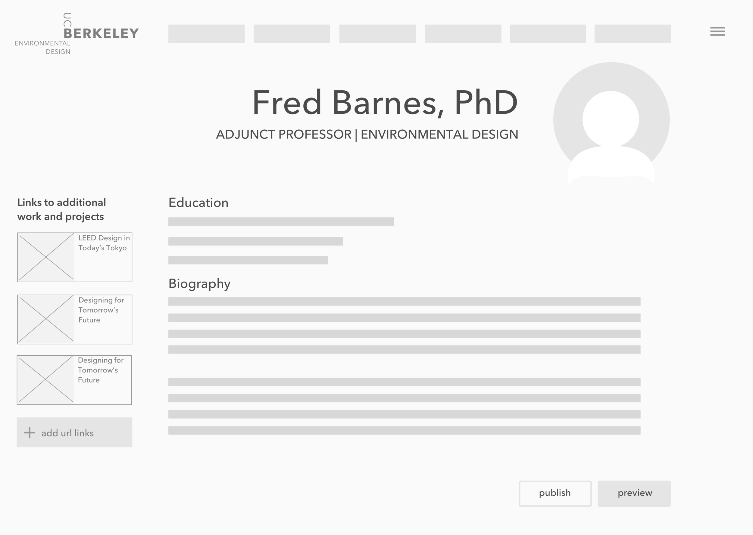
Edit the Instructor Bio Page:
Edit "Education" field to include Fred's school information.
Edit "Biography" field to describe Fred's teaching philosophy and more information about him.
Upload a photo to his page.
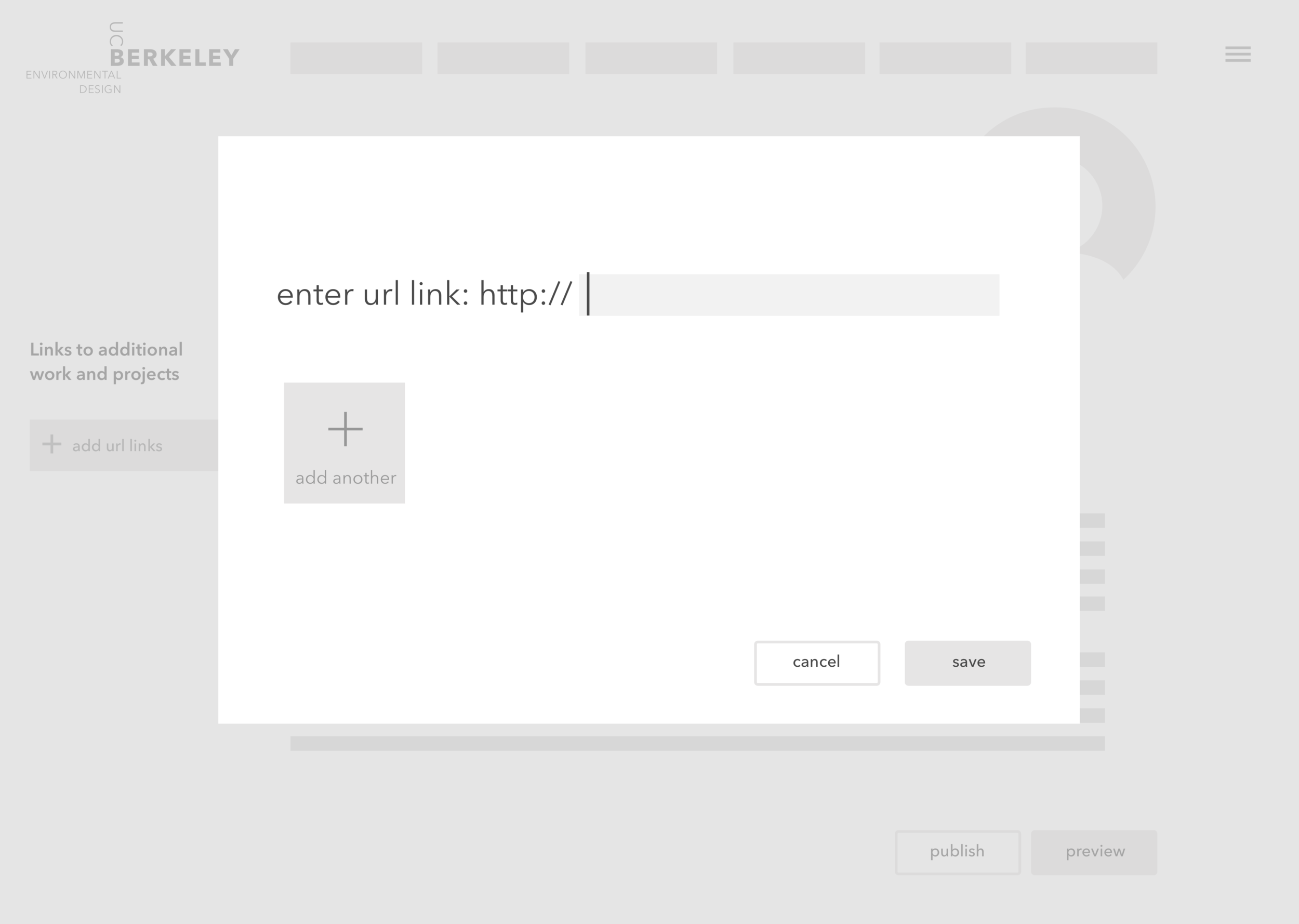
Add links to sources online to tell students more about Fred Barnes, such as links to websites, articles and projects he's been involved in.
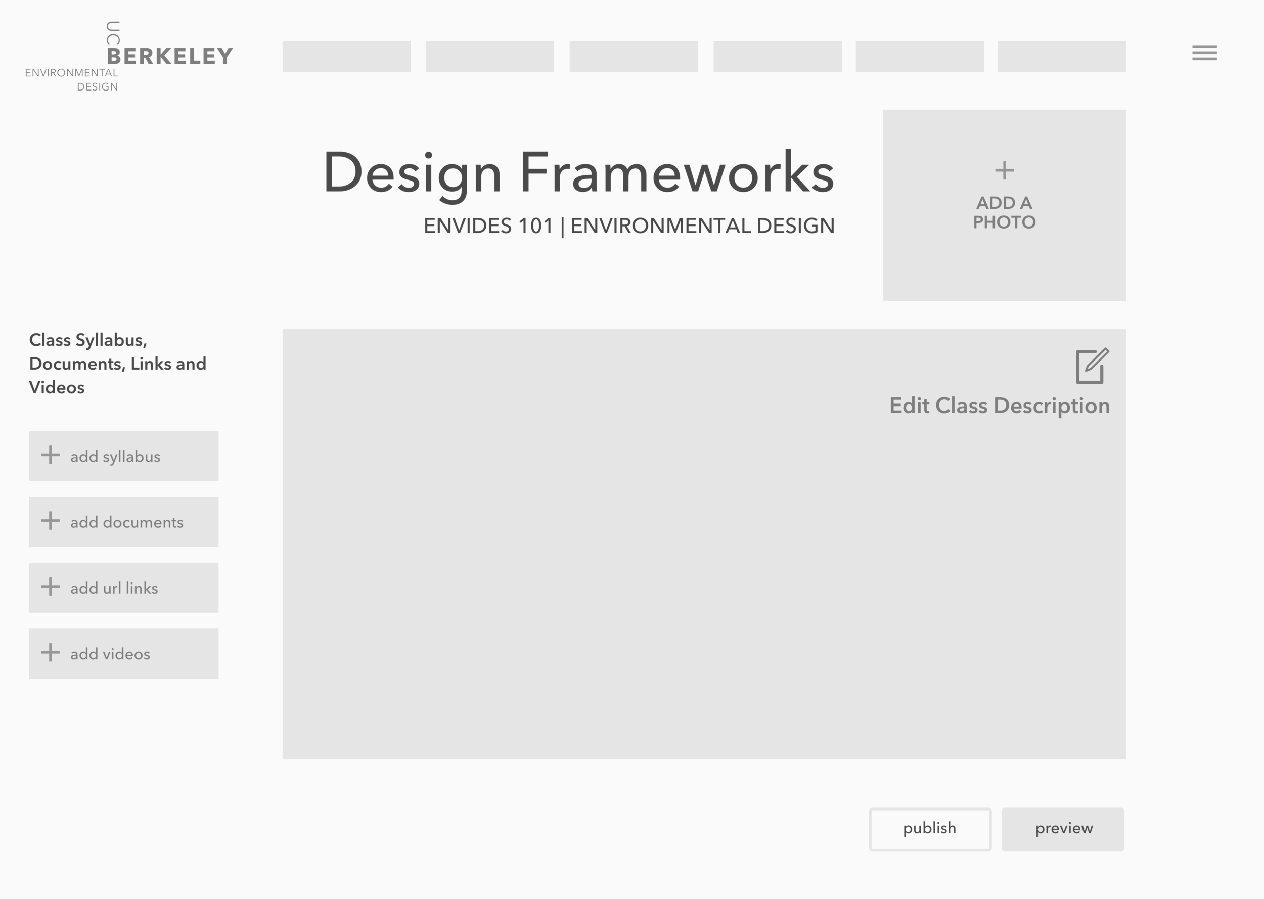
Edit the Class Detail Page:
Add a photo to the class page, and include the action to add to the UCB online image gallery.
Add a syllabus file to the Design Frameworks class page.
Add links to sources online to tell students more about the class and upload documents relating to the class.

5) Design Goals, by design principle
Predictability - The final design will allow instructors to access their pages easily, with an intuitive sense of where to start and how the page should look when finished.
Perceivability - Knowing that the instructors are busy and only visit this site at the beginning of each semester, the page designs need to be simple and lead the instructors through the act of filling each page out.
Learnability - Keeping the Instructor Bio page similar to the layout of the Class Page editor makes it easy for the instructor who needs to fill out multiple pages. Having clear breadcrumbs for navigation and feedback elements also help guide the way.
Consistency - With a nod to designs of profiles on social media pages, the pages allow the user to upload a custom image, add URL links and to enter custom text into available fields. Each field will have an edit symbol and the CTAs will clearly indicate the actions to take.
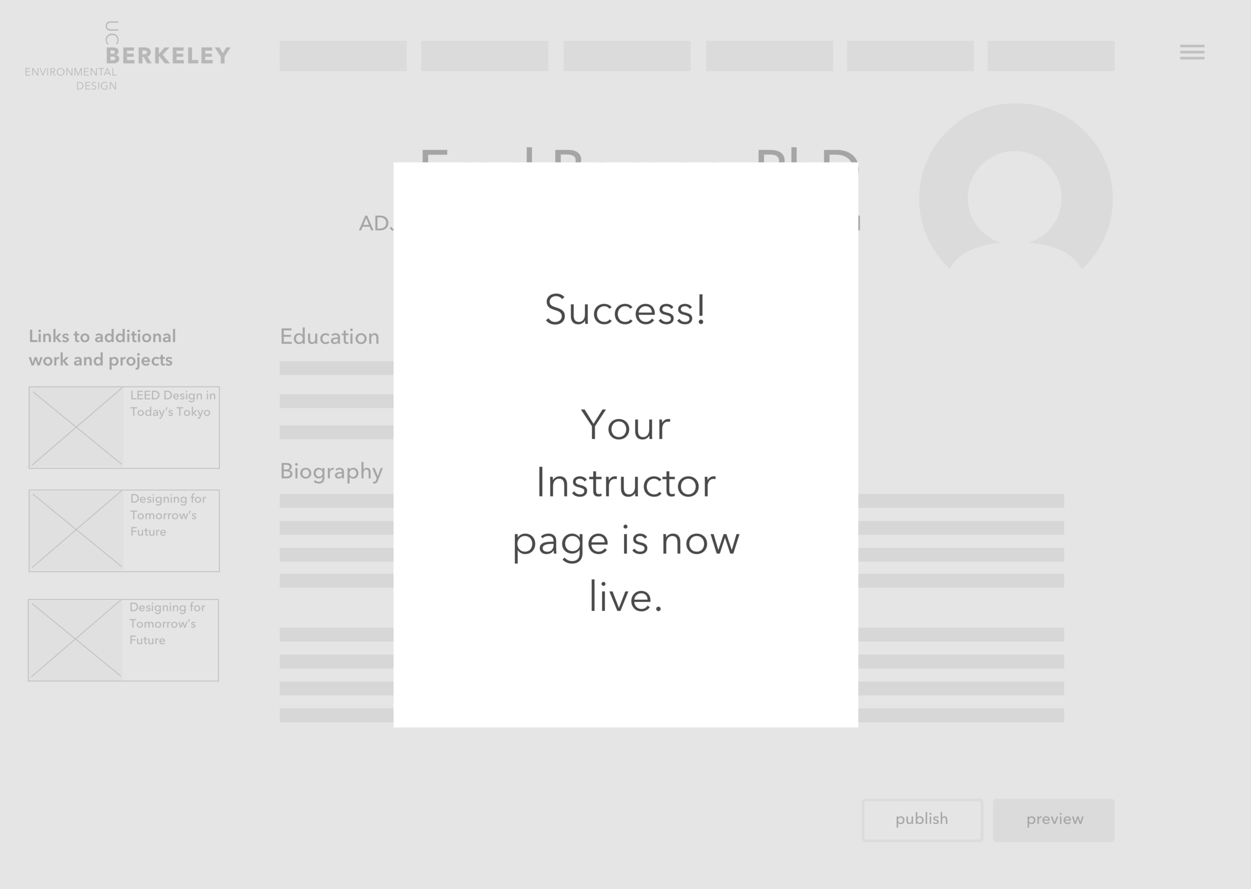
Feedback - The design shows a clear navigation breadcrumb icon to allow users to note where they are in the website. Each page name in the breadcrumb is a link to the page, so one can click it and travel, if they desire. Additionally, when “Publish” is selected, the site tells the user what information they are missing, or it shows a preview and adds one more link for making live after review. When that button is selected, a banner shows the user that the page has been published and is live.
6) Initial prototypes for the UC Berkeley Instructor login portal
7) Usability Test Key Findings
A study was conducted with three test participants, all with academic careers. They were given tasks to update miscellaneous parts of their pages, and each completed them successfully. In reviewing the problem areas, some key findings included:
All the focus and investment in design functionality has paid off. Users successfully completed all five scenarios in under 30 minutes.
This confirmed out approach: consistent interaction design, continuous user direction, minimalist style.
Quick-fix recommendations are:
Include previous and current classes taught in the Instructor Bio page.
Improve hierarchy, Instructor Bio description should come before Education field.
List out formal degrees in order, in the Education text field.
Apply color semantically, the "Now Live" bar should be green instead of yellow.
7) Final Revised Prototype
Based on the feedback we discovered, we made a revised prototype. We kept the visual page design minimal, while using such UI elements as a clean breadcrumb navigation bar, success banners for indicating when a page has been saved and is live, and making editable placeholder boxes with a clickable + for the user to recognize they can edit there.

This is a video of team SF Designers’ new ux design prototype for the UC Berkeley instructor's bio page edit flow.