
Photobomb - Mobile App for Showcasing Professional Photo Galleries
OBJECTIVE
Design a great place for professional photographers to share final images with clients. Make the images easy to view and navigate through, so that photographers will feel secure in knowing that their clients will have the best experience possible.
DESIGN PROCESS
1) Market Research | Compare Direct / Indirect Competitors
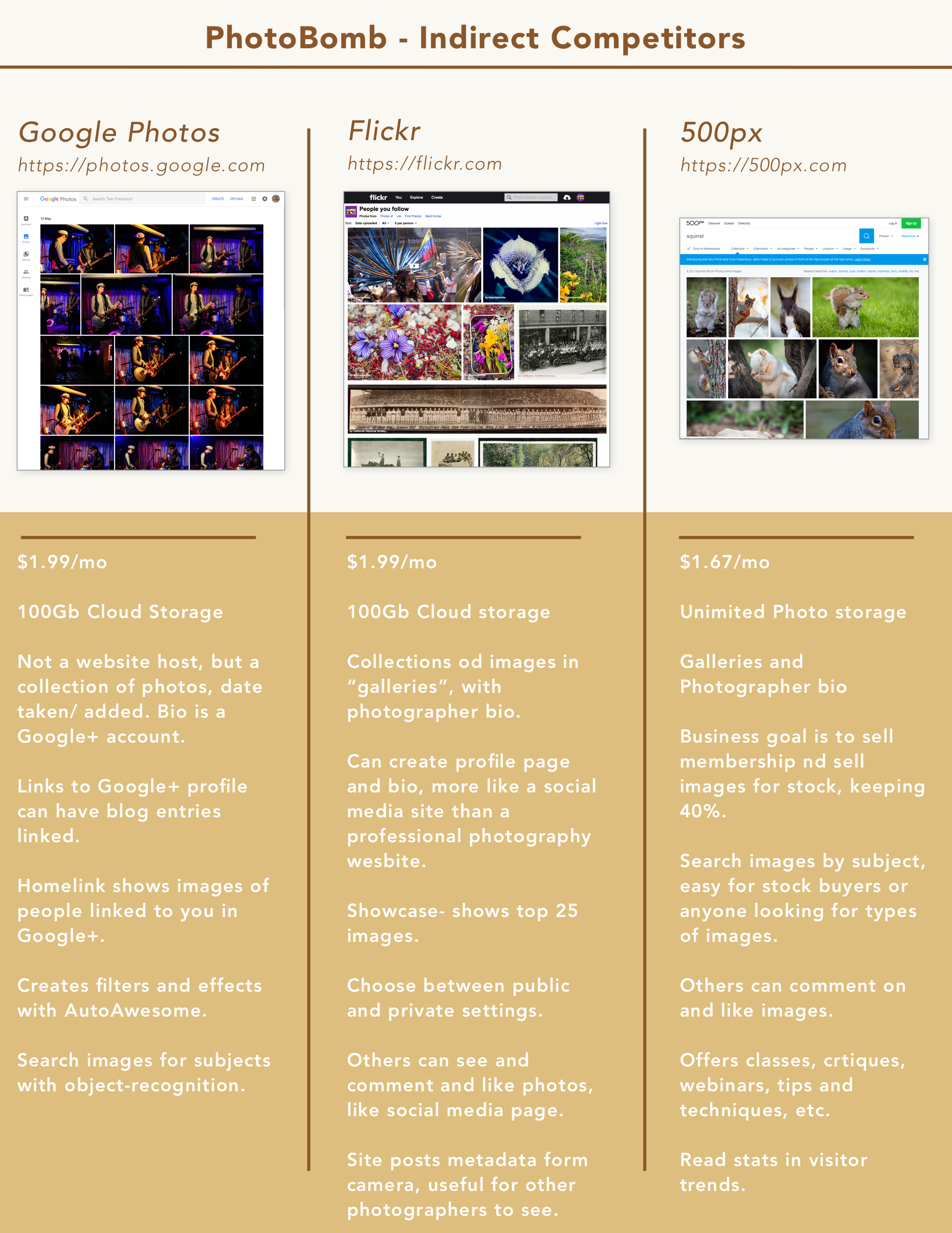
The initial step in creating Photobomb was to study both direct and indirect competitors to learn positive and negative areas of each existing business design. By listing out various features as well as price point, the study helped understand what currently is offered to customers from similar companies.

2) Customer Research | Create Personas
The next step was to survey professional photographers to learn their software habits and learn more about how they use their current image gallery hosting sites. From their feedback, patterns began to emerge.
100% use Dropbox to send photos to clients; for many this is in addition to using another image gallery hosting site.
75% reported that their current host could be improved upon.
61.9% feel that it’s important that the site be easy to use and intuitive to learn.
47.62% feel it’s important that the images upload quickly.
42.86% need the ability to host multiple galleries at once.
Fewer than 50% consider cost to be “very important” factor in choosing a hosting site.
33.33% report clunky navigation as a strong pain point with their current hosting site.
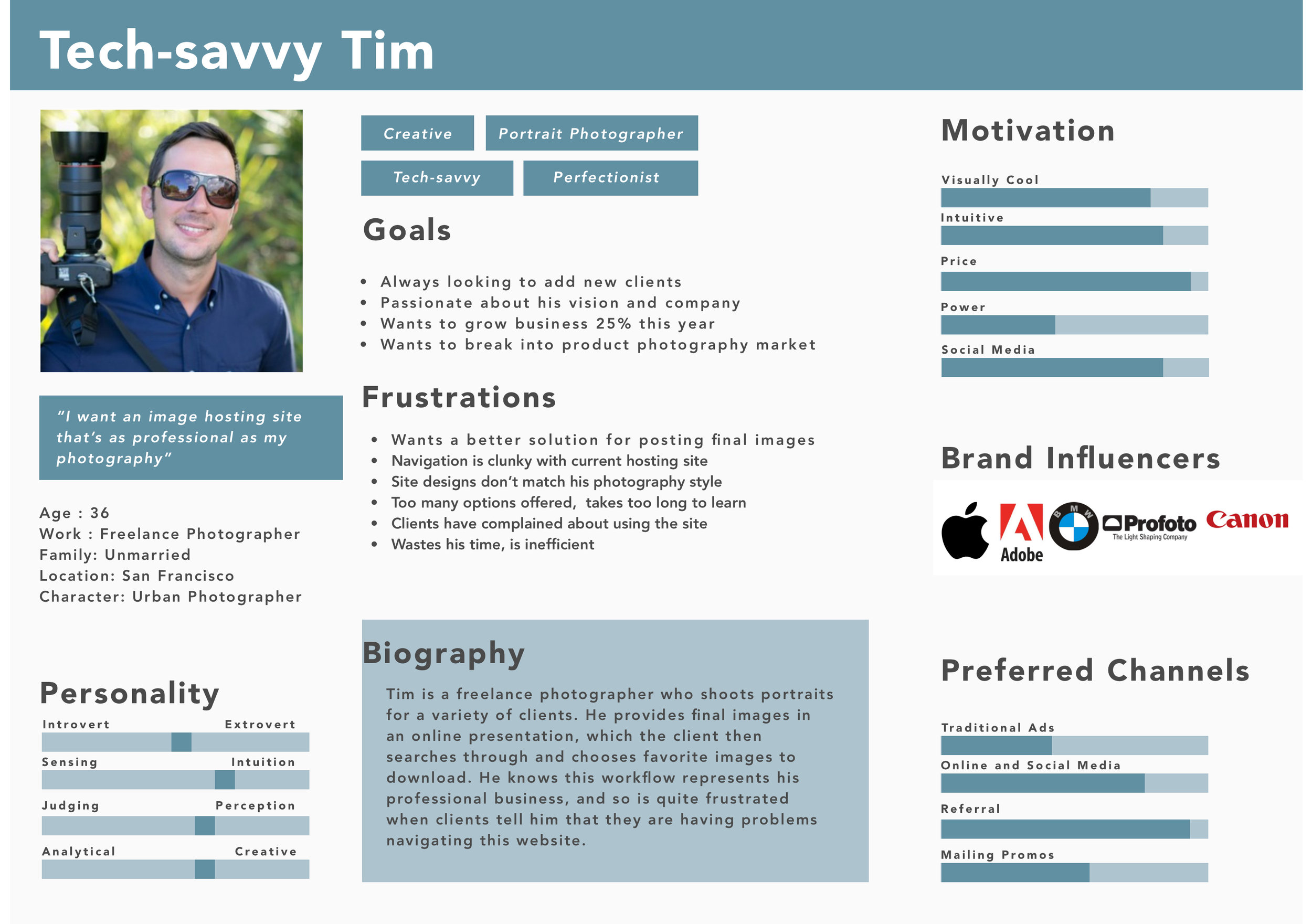
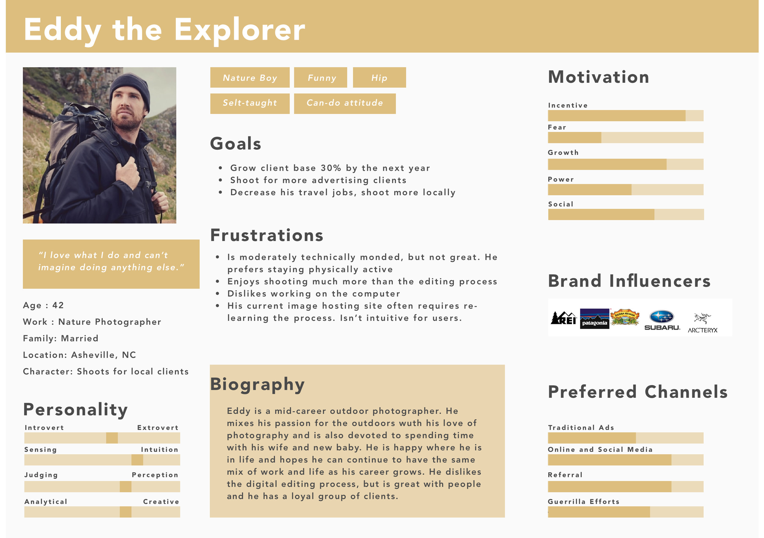
Pooling together commonalities from the survey participants, three personas were created to help illustrate a typical photographer customer.
Tech-savvy Tim, a tech-smart urban dweller, became the primary persona, while two secondary personas were created to illustrate additional users.

3) Define How Photobomb Will be Used | Storyboard and User Story
With specific users now visualized, the next step in the design process was to describe how this customer might use Photobomb. For this, a storyboard was created to showcase a scenario of various actions using Photobomb. According to a recent article on the Nielsen Norman Group blog, Rachel Krause writes that this method of using images "makes the story quick to understand at first glance and easy to remember.”


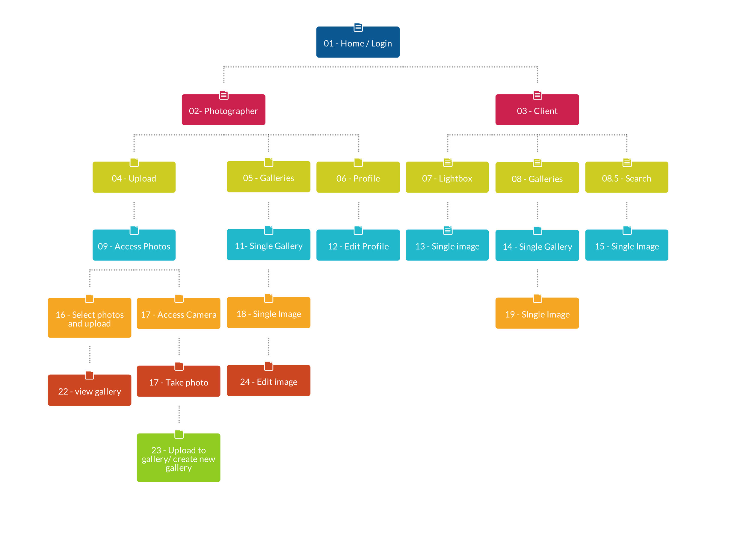
4) Initial Design | Sketches and Early Sitemap
With the customer goals sighted, the next step was to visualize the structure for the Photobomb app. Sketching out some early prototypes, the pages for each step began to take shape. Testing these designs on participants led to some valuable feedback about what was working well and where it was failing.


5) Redesign | Lo-fidelity Wireframes
After making some changes from early user feedback, the design moved into the next step of creating lo-fi wireframes. Seeing images represented as blocks was helpful towards thinking about the difference between portrait and landscape image display. Additionally, a number of things were tested and eventually removed, such as the header image and learning that the lightbox feature looked too much like the galleries.
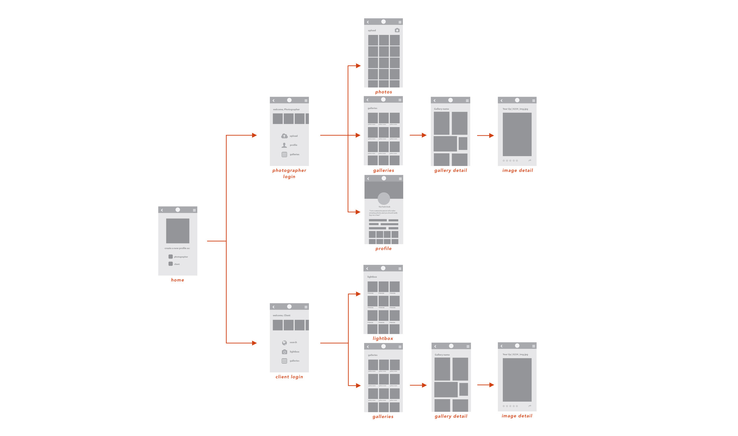
6) Final Design | High Fidelity Wireframes
As the design progressed, testing feedback determined that the login flow needed to be more actionable. Additionally, building UI elements, like a breadcrumb trail and clear navigation icons, helped users respond more positively to prototypes.
