
MotoHub - UX Design case study for a mobile app that provides motorcycle riders a place to connect with others and to organize and join upcoming rides.
OBJECTIVE
Create the initial ux design for a mobile app for motorcycle riders, beginning the process with company research and interviews, then building the early wireframes to begin user testing.
TOOLBOX
This project incorporated a range of software programs including Photoshop, Sketch, Principle, InVision and UserTesting.com. Pens and paper were also used, as well as a healthy supply of Post-Its.
DESIGN PROCESS
1) User Research : In-depth interviews | Surveys
Researching potential users of the app was the foundation of this project. Through interviewing motorcycle riders, pain points with organizing rides and goals for building a riding community were collected. Through this data, I developed an experience map and created the proto-persona Angela, MotoHub’s target user.
2) Design Research : Direct/ Indirect Comparisons | Design Brief | Mood Boards
Being a new company, I next undertook researching companies with similar customer and stakeholder goals. From here, a design brief was written and a mood board was created, highlighting various influential design elements, themes and page flows for a reference stockpile.
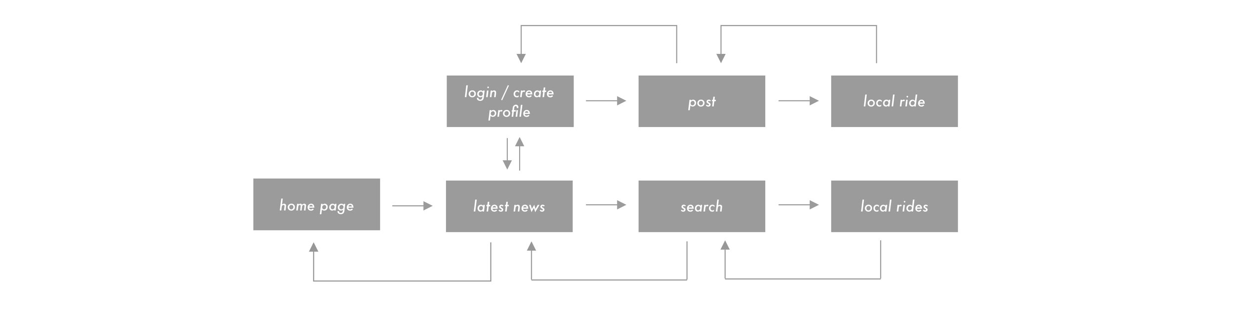
3) Design : Early Network Flow | Sketches
Next in the process was to design the early network and user task flow paths. This was followed by sketches to start building the initial design process to test on users.
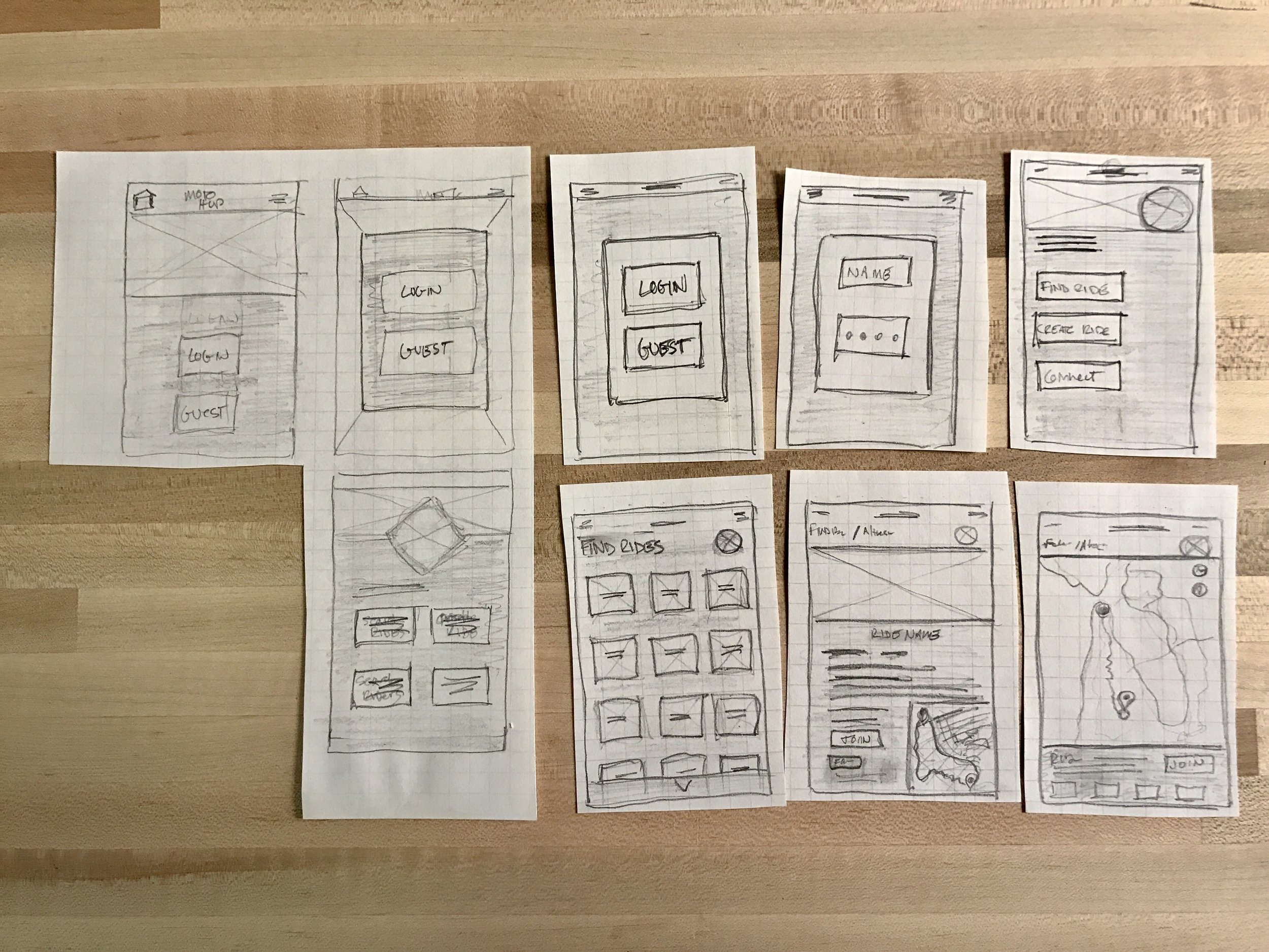
Presenting the initial sketches to users for feedback provided me with a number of insightful nuggets:
The news option is interesting, could it be viewed without creating a profile?
When searching for rides, how will users filter results?
Guest log-in is nice, what exactly can a guest do without creating an account?
Users reported want to see more info about the rides than just an image and one line of info.
Suggestion to increase the map size, as user would determine interest in a ride based on route.
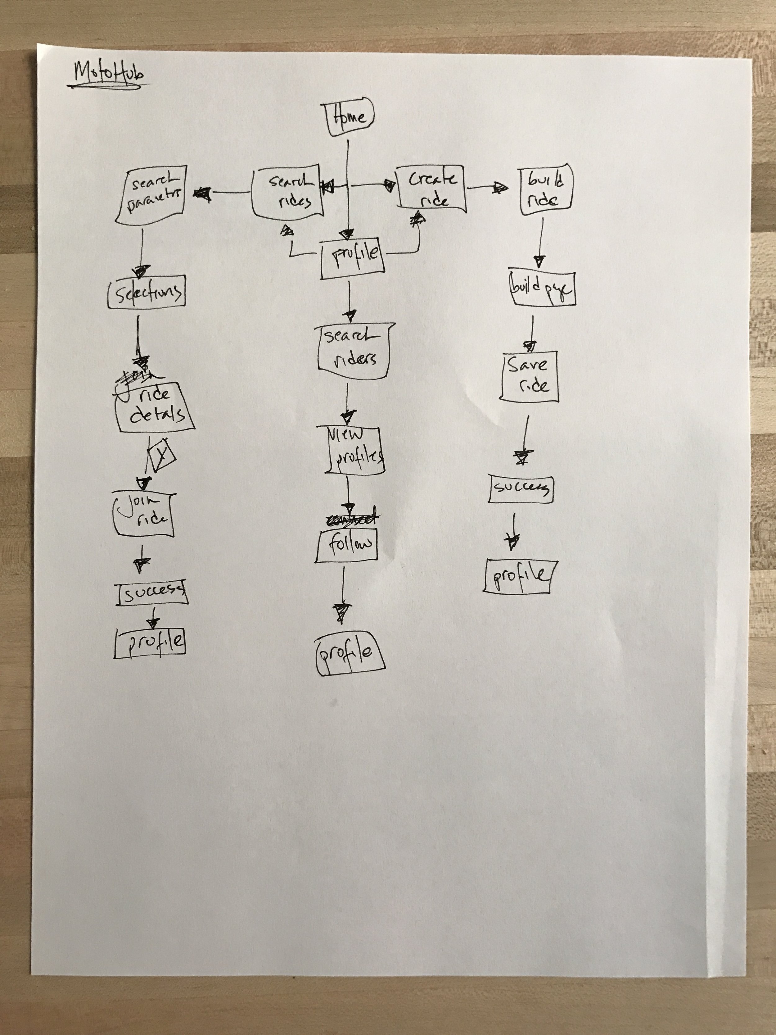
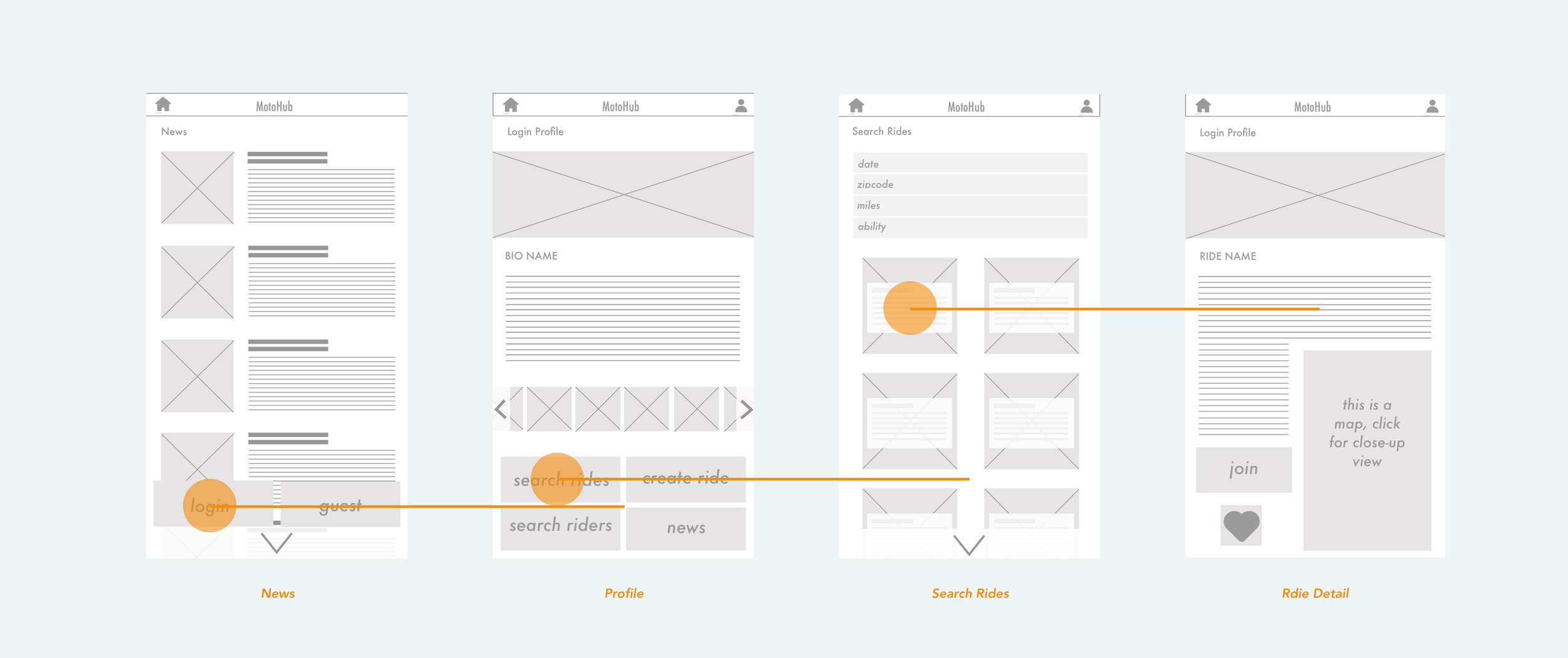
4) Redesign : Revised Task Flow | Lo-fidelity Wireframes

Testing participants on task completion showed some valuable insights to take into the next redesign:
What will the News section be showing?
How is clicking the heart selection different from "Join" button?
The text in front of the ride images in Search Rides is too small.
The text wrap in the Ride detail page might get confusing.
Filtering system is good, but will it remember previous selections?
Test participants reported wanting to see an overview map for the rides, so feature this.c
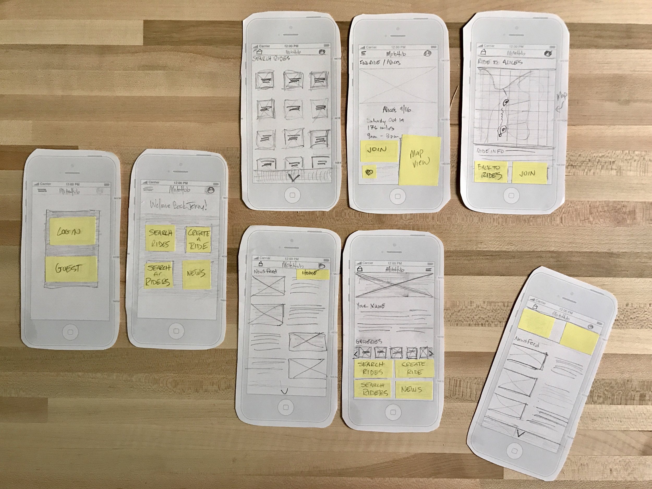
5) Medium Fidelity - Usability Testing
Taking this feedback into the next iteration was a medium-fidelity wireframe. This was brought into a test in UsabilityHub.com, where 10 users were asked to log in and join the ride called “SF to Alice’s on 11/11”. The success rate was only 30%, telling me that there were definitely some issues with my design.
These test results prompted changing a few more key things before moving into the final design process and adding in color and more visuals to create a collection of high-fidelity wireframes:
I’d allowed users to login as a Guest, this proved to be confusing, so I decided to omit Guest for now.
The heart icon for liking a ride is confusing, so it was removed and provided only two choices: Join or Pass.
Since 30% of users tested were lost in the process of the “select a ride” goal, I revised the user flow to make Search Rides the primary goal of the app.
There is a conflict between the goals of the app: News vs. Search Rides. This resulted in finally removing the News feature (for now).
Revisiting the on-boarding flow, I developed a carousel of images showcasing the benefits of joining MotoHub.
6) Final high-fidelity prototype / InVision prototype

The final step with this design project was to add color and final UI elements and put into a clickable prototype in InVision. Working in a new on-boarding experience, the path was also honed down to create an account and begin searching for rides.
CONCLUSION
I learned that my original design, with an optional guest log-in and a news feed, created confusion towards successfully completing the more important goal of searching for rides within the community. Additionally, having a secondary CTA button, where a certain ride can be saved for later, lead to distracting test participants from successfully completing a given goal.
Documenting the process steps of initial research, rough wireframe design, remote user testing, then re-designing an improved prototype was an extremely engaging project. Although the project deadline is over, the next steps would be to test these hi-fidelity wireframes on users and again resolve the areas where testing leads to failure.